cupcake ordering platform
team
Individual
Timeline
Jan 2023 - May 2023
tools
Figma, Photoshop, FigJam, Whimsical, Miro
key responsibilities
UX Research, UX Design, Wireframing, Prototyping, Competitive and Task analysis
Redesigned the Toronto Cupcake website, resulting in a 50% increase in checkout completion and a 40% reduction in cart abandonment.
Leveraged user research and feedback, driving a 25% improvement in purchase rates and significantly boosting user satisfaction.
Improved pricing visibility and streamlined navigation, reducing time spent searching for products by 30%.
Optimized call-to-action visibility, leading to a 50% increase in user interaction with key site features.
Reorganized information architecture, enhancing navigation efficiency by 100%, creating a more intuitive browsing experience.
At a glance
Brief overview of the entire project
What is Toronto Cupcake?
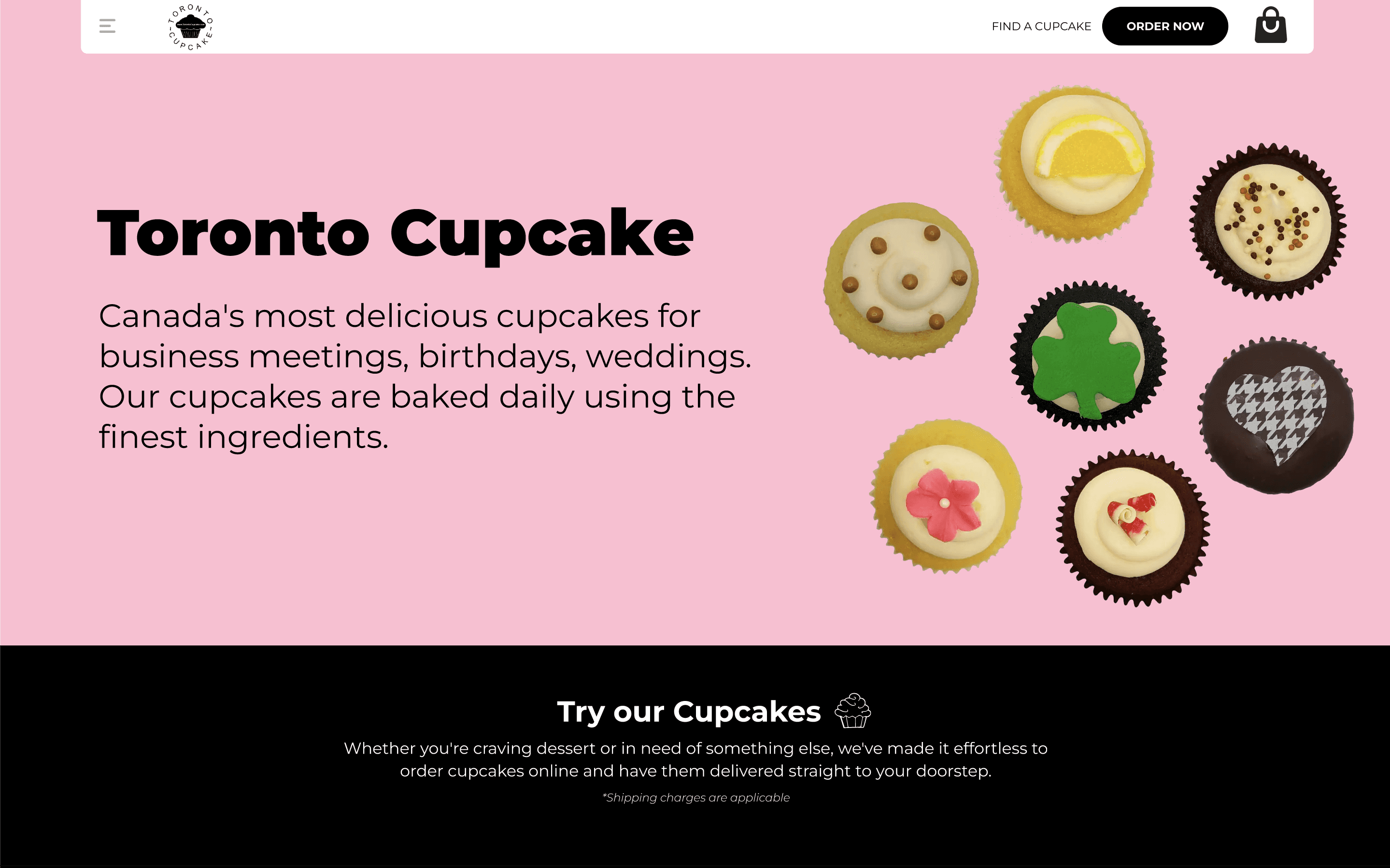
The Toronto Cupcake website is an online platform that offers an exquisite selection of gourmet cupcakes and chocolate confections in Canada. Their delightful treats are handcrafted with the finest ingredients, offering over 30 daily flavors with customizable options for special occasions. From birthdays and weddings to baby showers and anniversaries, Toronto Cupcake caters to diverse events with a focus on delivering handcrafted delights made from the finest ingredients.
Problem
Inefficient Navigation: The menu bar's hidden main menu, represented by the hamburger icon, made it challenging for users to navigate the website efficiently. This could result in a confusing user experience and a higher bounce rate.
Lack of Consistency: The website lacked a general structure and consistent color palette across different web pages, leading to an inconsistent user experience.
Quality of Cupcake Photos: The quality of cupcake photos on the website needed improvement to enhance the overall visual appeal and entice customers.
Checkout and Payment Process Concerns: Users encountered difficulties with the checkout and payment processes, which raised concerns about the overall user experience and could potentially lead to cart abandonment.
Enhance User Experience
Improve the overall user experience on the Toronto Cupcake website to increase user engagement and encourage seamless navigation.
Rebranding
Create a new branding strategy that effectively communicates the identity of Toronto Cupcake and establishes a unique brand presence.
Intuitive Navigation
Design a user-friendly navigation that allows visitors to easily find relevant information, minimizing the number of clicks required to access key sections.
Solutions
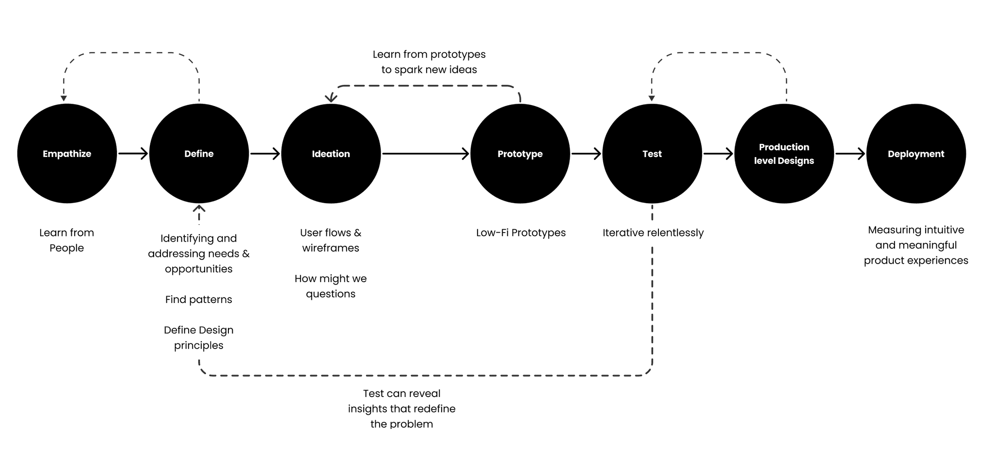
The Process
How did I reach to final solution?
Empathize
Planning and Discovery
Surveys and Interviews
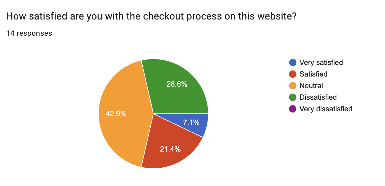
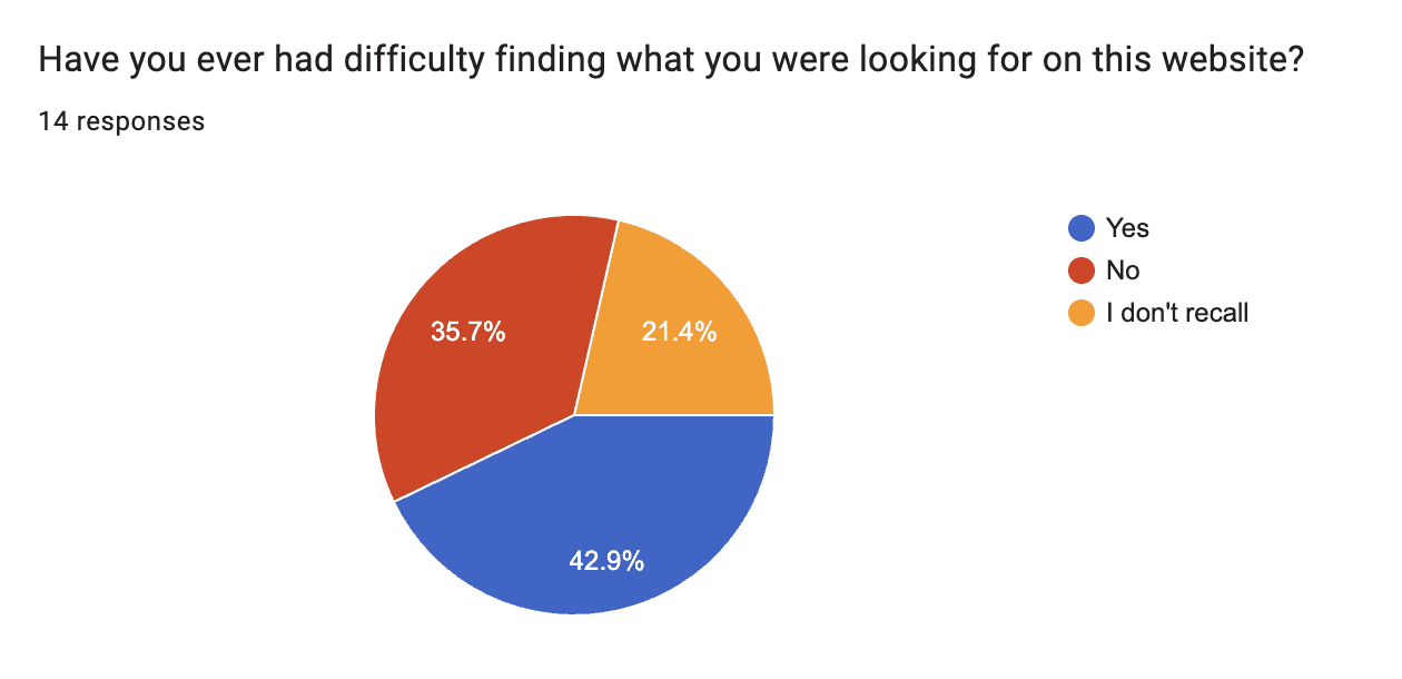
To better understand user needs, I conducted surveys and interviews to identify key usability improvements for the Toronto Cupcake website. The research aimed to pinpoint what users valued most and where the site could be enhanced.
Survey Insights:
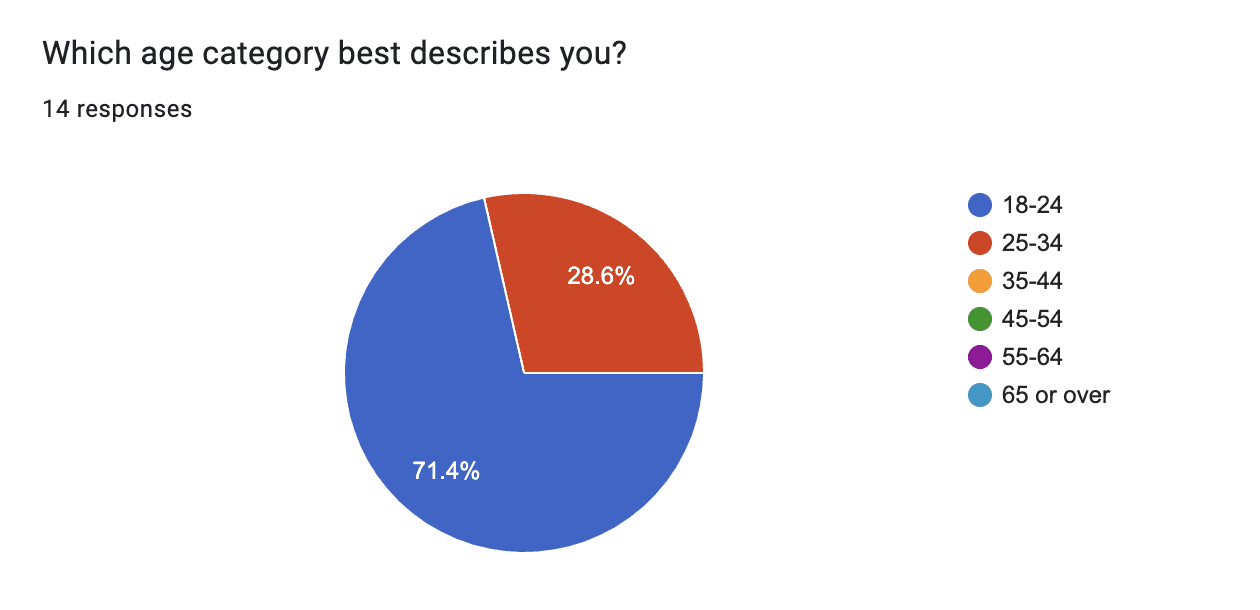
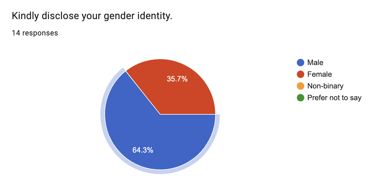
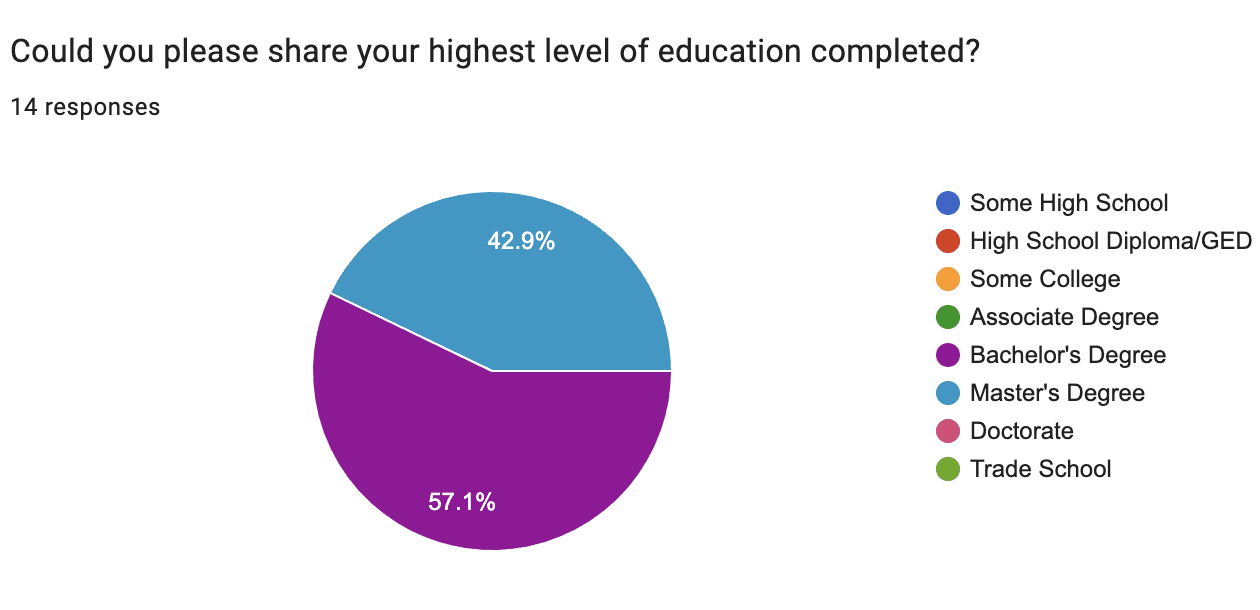
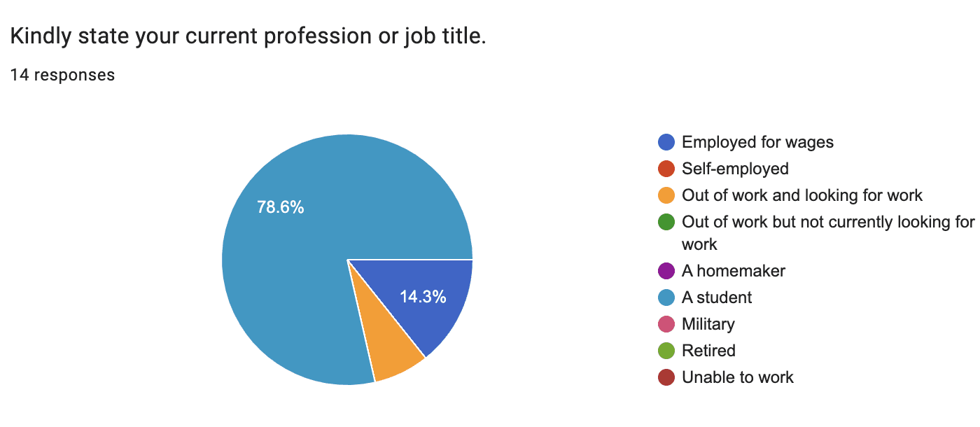
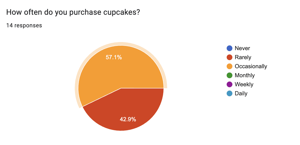
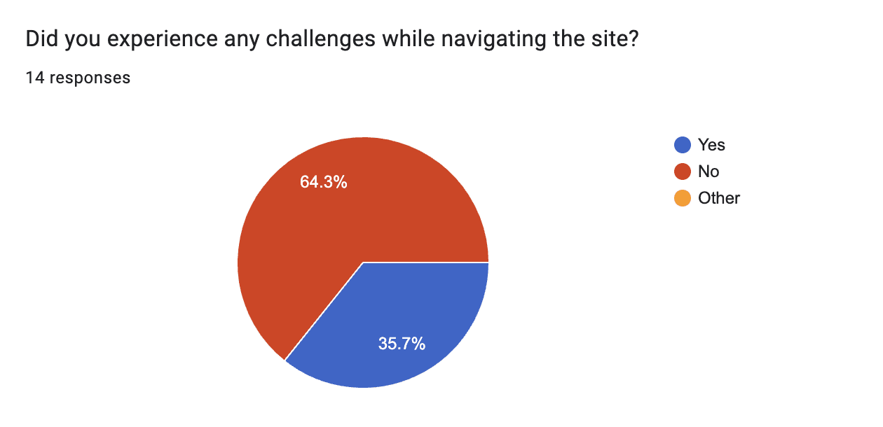
14 participants completed surveys focusing on demographics, shopping habits, and overall website usability, providing key data on user behavior and preferences.
User Interviews:
I conducted 5 in-depth interviews, where participants shared their frustrations and suggestions. They also completed tasks related to product search, customization, and checkout, uncovering specific usability challenges.
This user-centered research guided the redesign, enabling the creation of a more intuitive, user-friendly site that better meets customer needs and improves overall satisfaction.
Responses
Methodology
Participants were selected based on their potential as representative users of the target audience, considering factors such as age, location, and cupcake-buying habits.
Interviews were conducted either in person or remotely, depending on participants' preferences and accessibility.
Participants were given the task of ordering a dozen cupcakes through the Toronto Cupcake website.
Open-ended questions allowed participants to share candid and insightful feedback.
The interviews provided valuable firsthand insights into user preferences, pain points, and expectations.
Key Insights
Navigation and Usability: Users encountered difficulties with website navigation, particularly during the checkout process. They sought clearer and more intuitive pathways for efficient order completion.
First Impressions: Visual appeal, including low-quality product images, significantly influenced users' initial impressions of Toronto Cupcake, capturing their attention.
Website Responsiveness: Users valued seamless and responsive experiences across various devices, emphasizing the need for mobile-friendly design.
Checkout Process: Concerns were raised about the checkout and payment process, highlighting the importance of a streamlined and secure flow to instill user confidence.
Outcomes
The user interviews provided valuable qualitative data, shaping subsequent stages of the UX design process.
Understanding user needs and preferences enabled me to identify specific areas for improvement and optimize the website.
As a result, these insights guided my design decisions, creating a user-friendly and visually captivating website for Toronto Cupcake.
The enhanced user experience aims to increase user confidence and foster greater engagement with the Toronto Cupcake brand online.
Heuristic Evaluation
A heuristic evaluation of the Toronto Cupcake website was conducted using Jakob Nielsen’s 10 usability principles, focusing on key areas such as navigation, content presentation, and the checkout process. The evaluation revealed significant usability issues.
Notably, visibility of system status was lacking on the checkout pages, leaving users unsure of their progress. The match between system and real world was also poor, with users struggling to find actions like the "View Cart" button. User control and freedom was limited by the absence of breadcrumbs, making navigation difficult.
Other issues included inconsistent typography, hidden product prices, and an overwhelming checkout page filled with cluttered information. These problems hindered the shopping experience.
This evaluation identified critical flaws early, guiding the redesign to ensure a more intuitive and user-friendly website.
Competitive Analysis
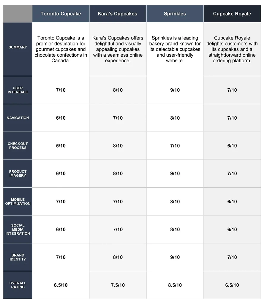
I conducted a comprehensive competitive analysis to gain valuable insights into how Toronto Cupcake's main competitors are catering to their customers' needs. I thoroughly examined the design and functionality of various cupcake websites to gain valuable insights into industry trends and best practices.
This competitive analysis enabled me to make informed design decisions and implement strategies to ensure Toronto Cupcake's website stands out in the competitive market, offering a superior user experience to its customers.
The analysis involved evaluating the websites of
Methodology
Selection of Competitors: I carefully selected the main competitors in the gourmet cupcakes industry to ensure a relevant and representative comparison.
Website Evaluation: I thoroughly examined each competitor's website, assessing aspects such as user interface, navigation, visual design, product presentation, and the checkout process.
Feature Analysis: I identified and analyzed key features, including customization options, customer reviews, promotional campaigns, and loyalty programs, to understand their impact on the overall user experience.
Competitive Analysis
Outcome
The insights gained from the competitive analysis informed the UX design decisions for Toronto Cupcake's website.
By understanding the successful features and industry best practices of competitors, I aimed to create a website that not only differentiates Toronto Cupcake from its competitors but also provides a delightful and user-friendly experience for its customers.
Task Analysis
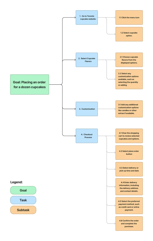
I conducted a task analysis of the Toronto Cupcake website, focusing on the checkout flow and its comparison with competitors' streamlined processes. This analysis identified pain points and areas for improvement, leading to a streamlined user experience, and intuitive website navigation.
Methodology
Defining Tasks: I focused on the task of placing an order for a dozen cupcakes on the Toronto Cupcake's website. I also examined how competitors facilitated the same task on their respective websites.
Step-by-Step Evaluation: I broke down the checkout process into individual steps, noting the actions required by users at each stage.
Comparative Assessment: I then compared the number of steps and screens needed to complete the checkout process on Toronto Cupcake's website with those of its competitors.
Task Analysis
Outcome
The task analysis findings provided valuable insights into the checkout process on Toronto Cupcake's website and its competitors. The analysis also helped me prioritize design changes that would lead to higher customer satisfaction and increased conversion rates on the website.
Define
Target Audience
Who are the users
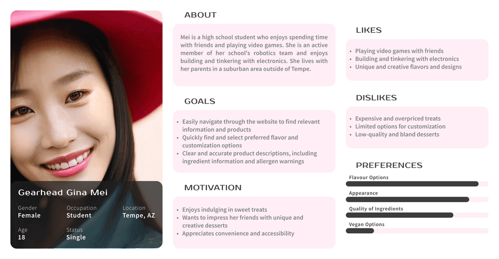
Students: Individuals looking for affordable, customizable treats for personal enjoyment.
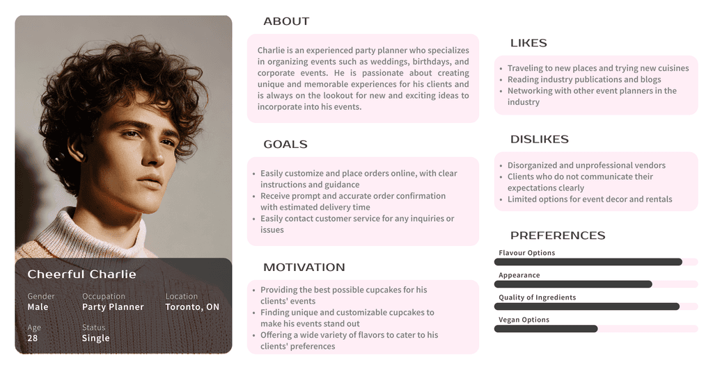
Party Planners: Event Organizers needing bulk orders and reliable delivery for special occasions.
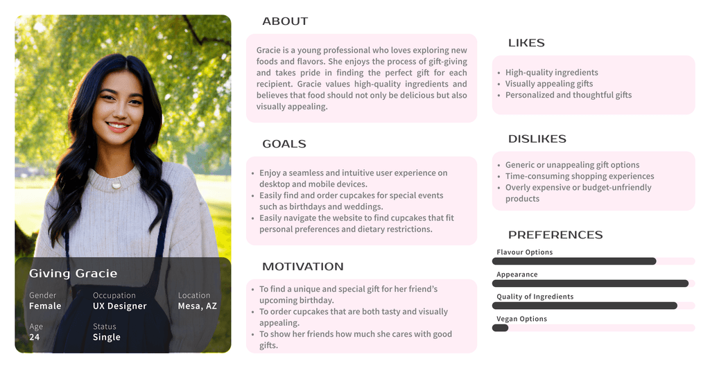
Gift Givers: Gift shoppers seeking a seamless experience and clear dietary information for personalized cupcake orders.
User Persona
Based on the survey results and user interviews, I developed three personas to represent key user groups of the Toronto Cupcake website. These personas were created using demographic and behavioral data, including age, occupation, purchasing habits, and specific frustrations with the site.
The primary goal in creating these personas was to gain a deeper understanding of the target users and their distinct needs for a more effective website redesign. By tailoring the design to meet the unique requirements of each persona, we could address their pain points and improve their overall experience on the site.
Design
Branding and Identity
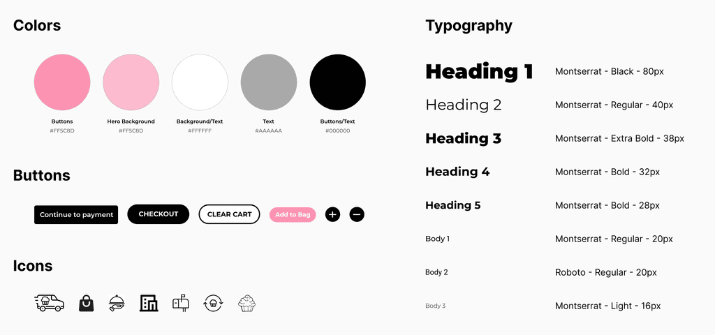
I developed a compelling brand strategy for Toronto Cupcake, aiming to differentiate it in the competitive gourmet cupcakes market. To visually represent the brand, I carefully selected a complementary color palette and typography and established clear guidelines for imagery. These elements reflected Toronto Cupcake's essence of simplicity, elegance, and joy, creating a cohesive brand identity.
Design Components
Sitemap
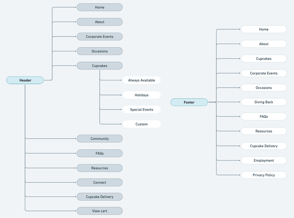
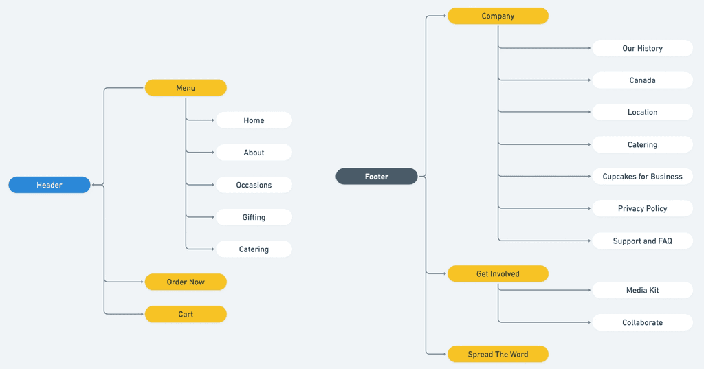
I analyzed and improved the website's navigation to create a more user-friendly experience. By restructuring and grouping similar pages together, I enhanced the site's information architecture, making it easier for users to access relevant content and reducing navigation complexities.
The previous sitemap of the Toronto Cupcake website had a relatively complex navigation structure, which users found confusing.
The main menu was hidden behind a hamburger icon, requiring users to click multiple times to access essential pages like the Menu, About Us, and Events.
This lack of a clear and consistent information architecture led to a disjointed user experience, potentially resulting in higher bounce rates and decreased user satisfaction.
The revised sitemap focused on simplifying navigation and improving the website's information architecture.
I grouped similar pages together under relevant categories to provide users with a more intuitive and straightforward browsing experience.
The revised sitemap now features a visible and accessible main menu on the Home page, allowing users to quickly navigate to key sections such as Menu, About Us, and Events.
Ideation
Refining Wireframes
Wireframe
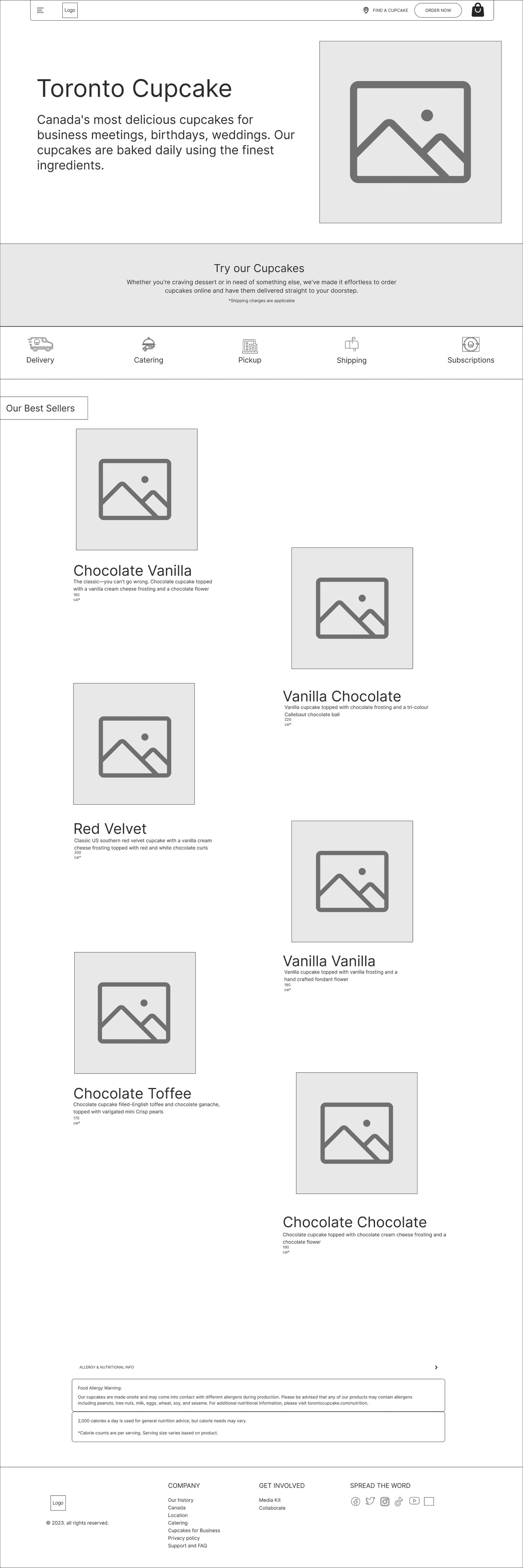
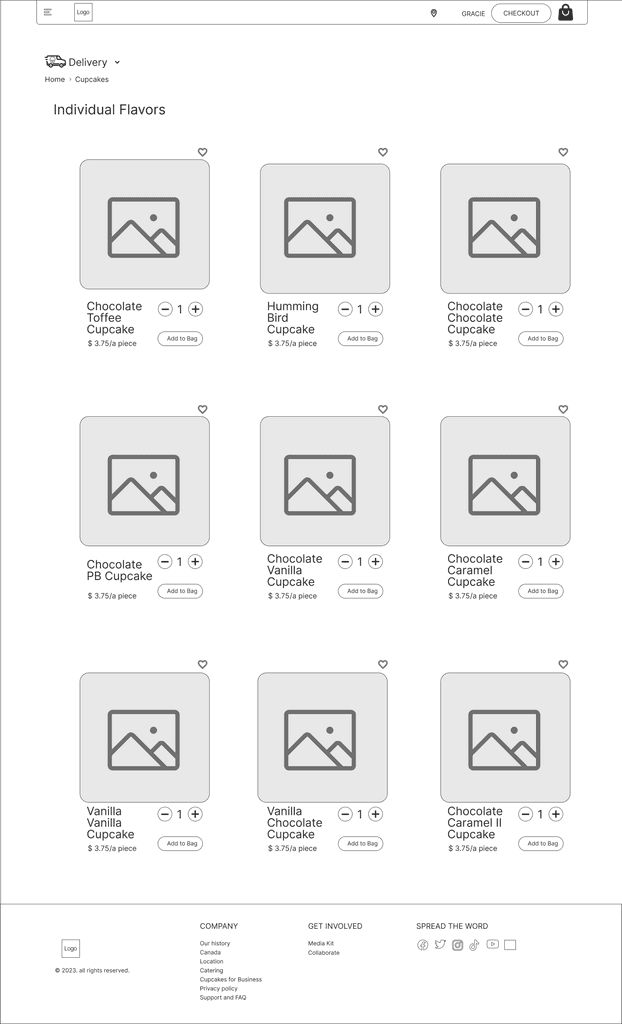
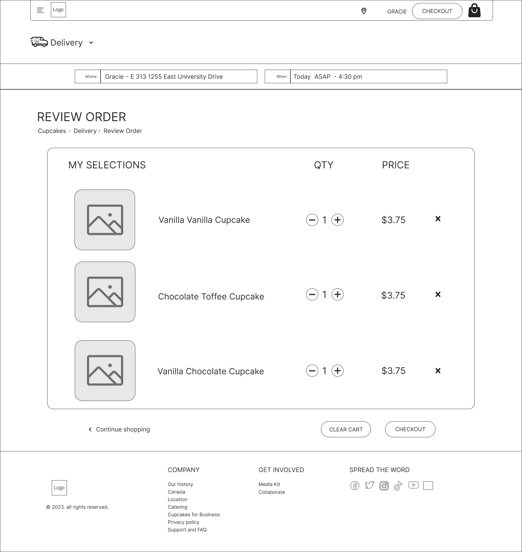
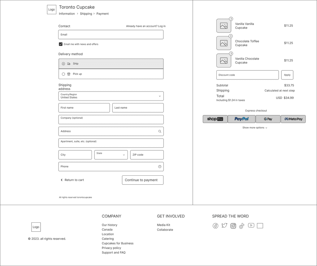
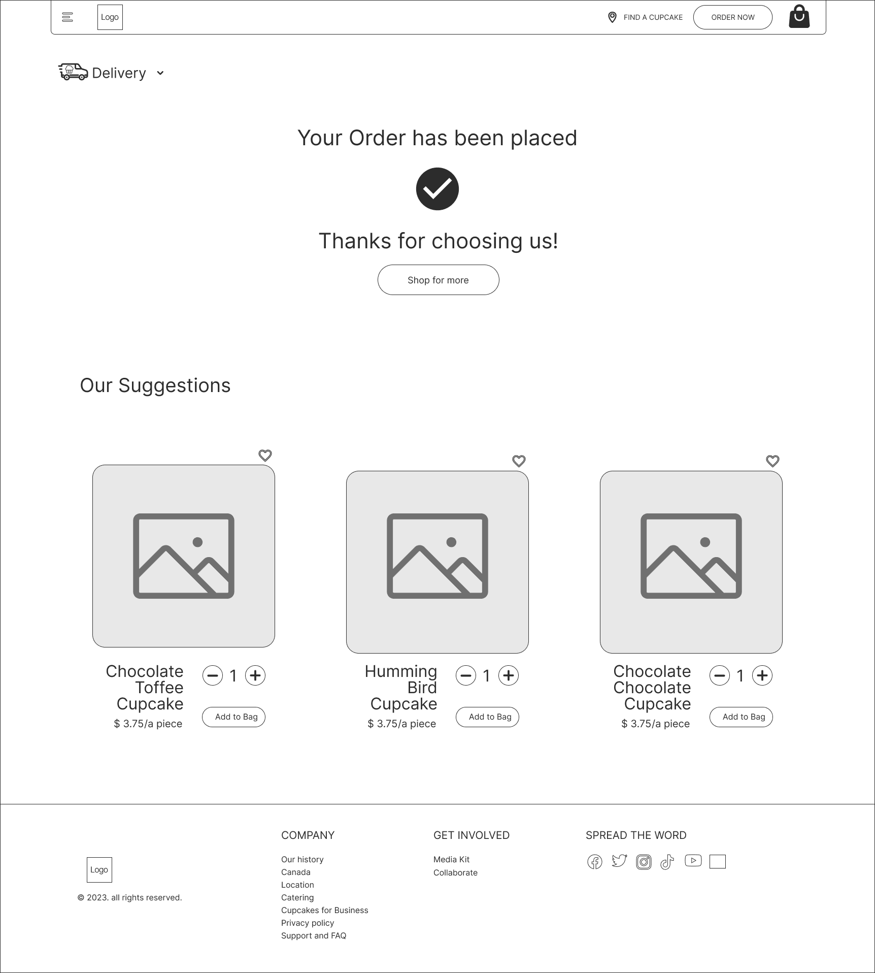
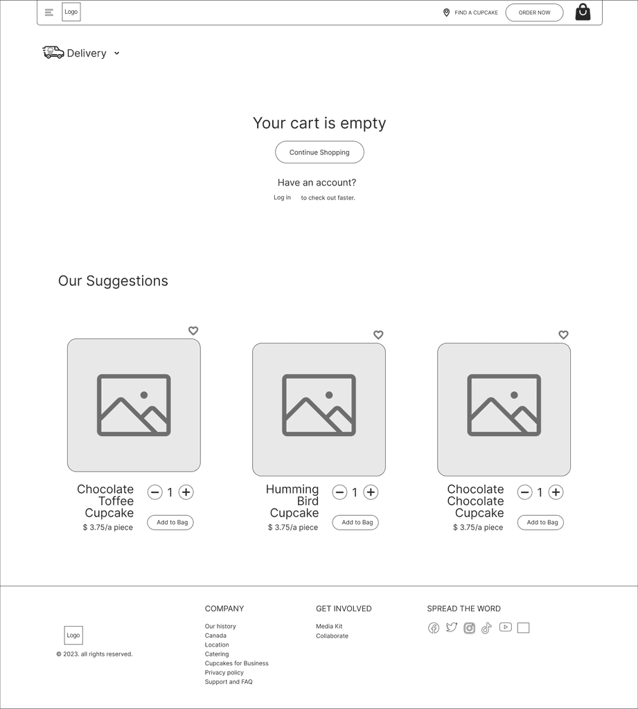
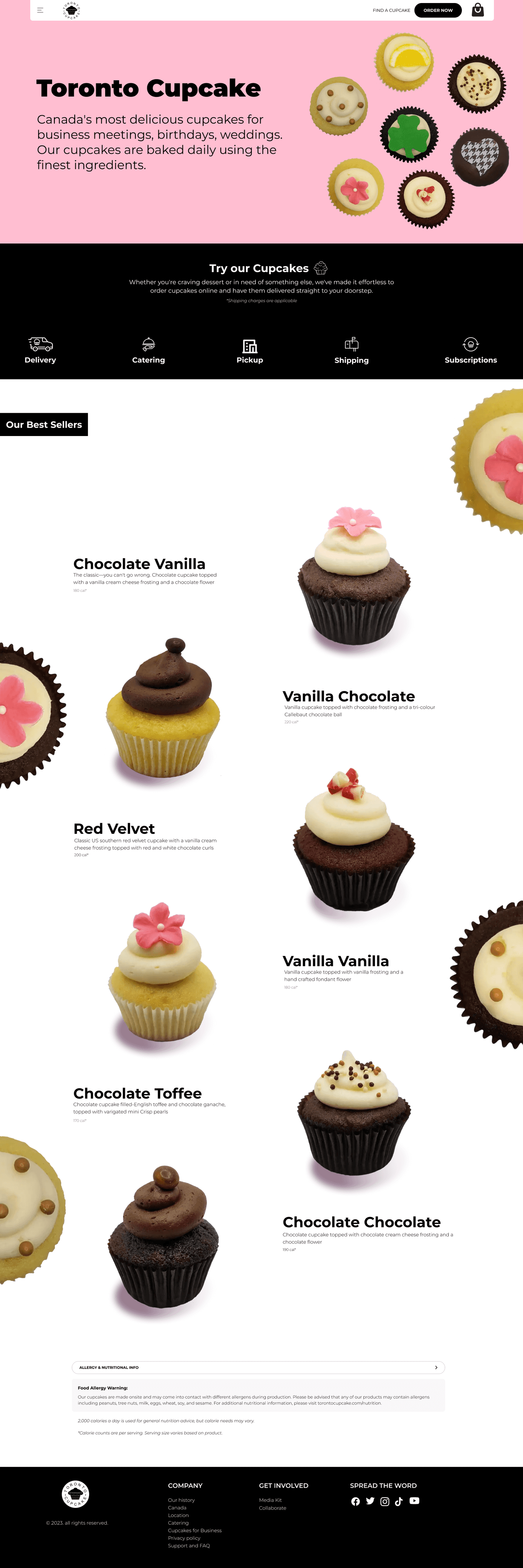
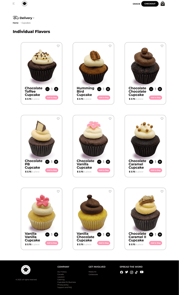
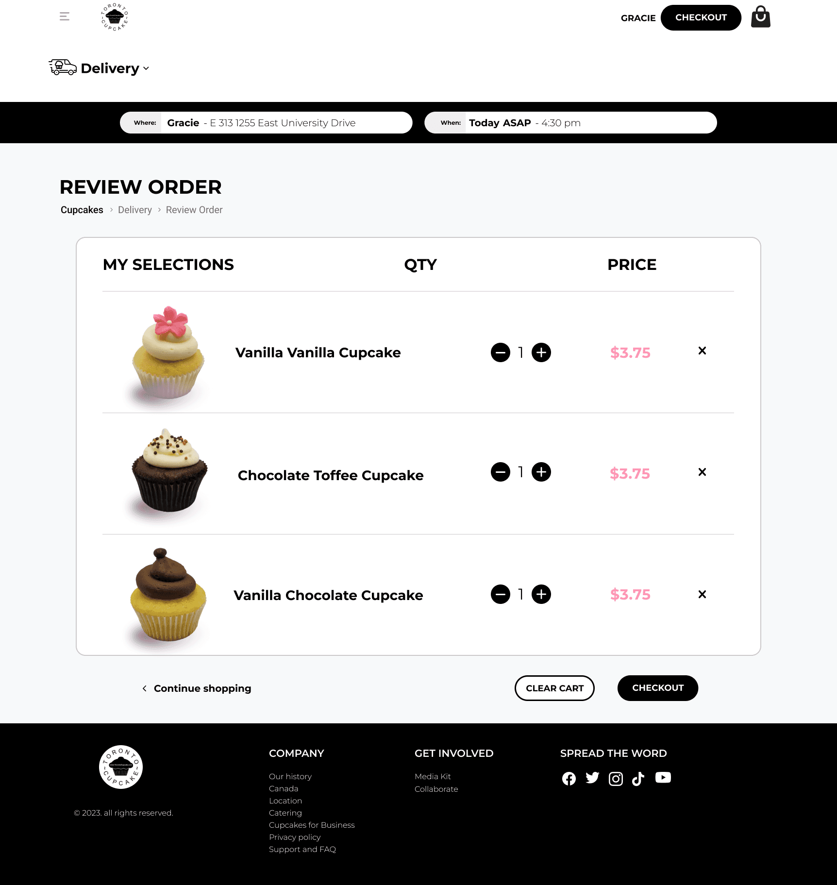
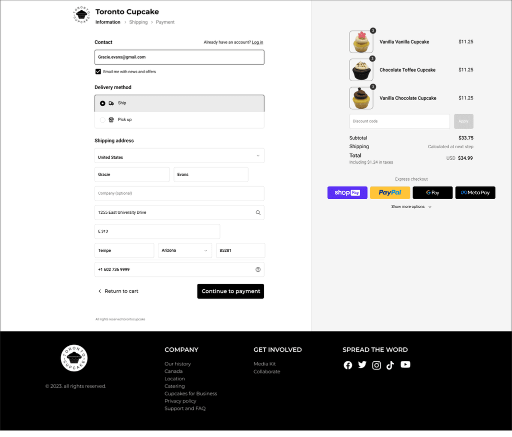
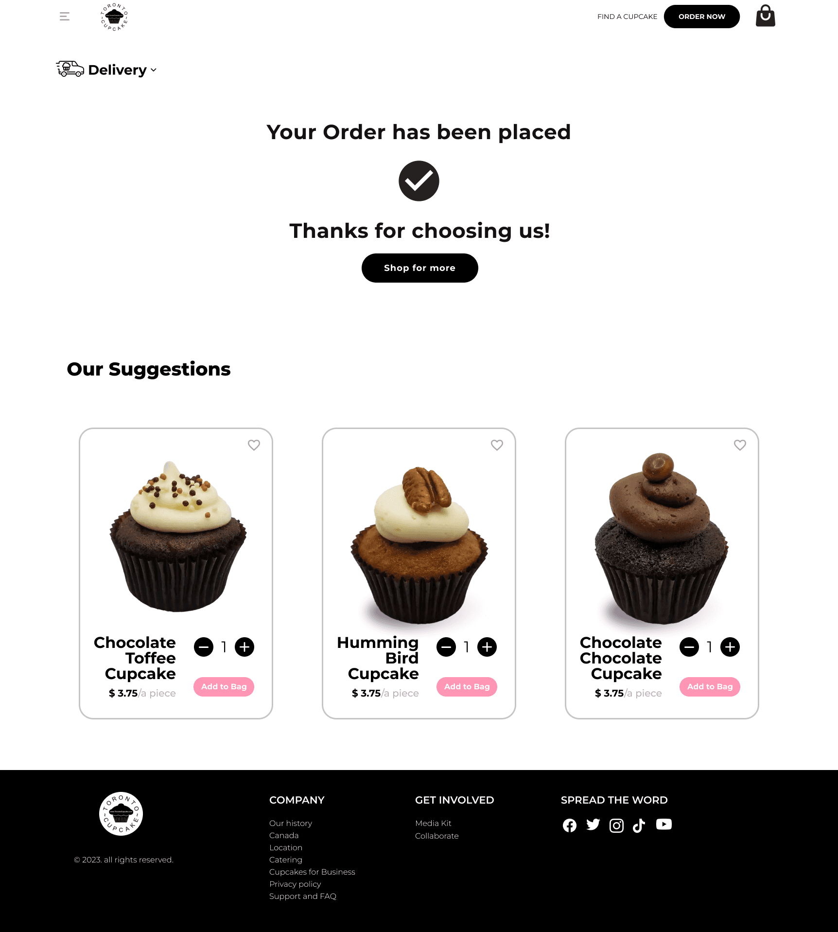
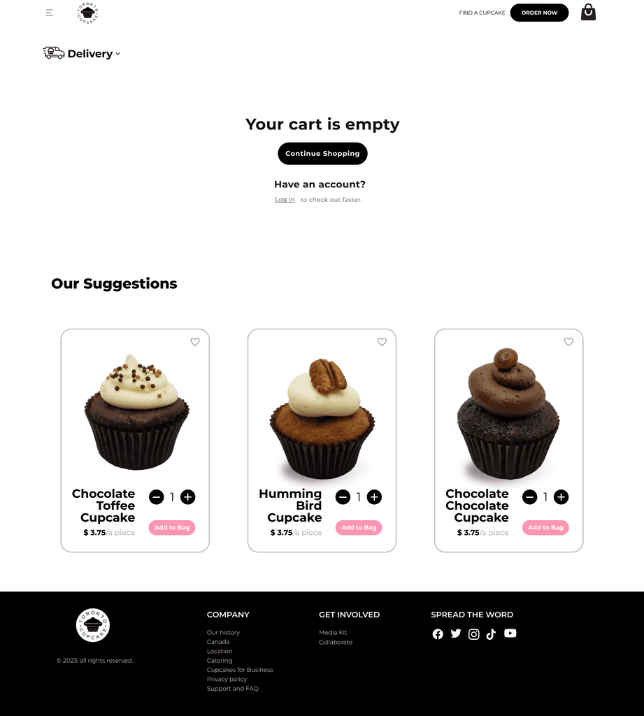
I translated the research findings into detailed and visually clear blueprints for the key pages of the Toronto Cupcake website. By strategically arranging elements and content, I ensured an intuitive user experience and easy navigation. This iterative process allowed for feedback and refinements, resulting in a visually appealing and user-centric website design that aligns with the project's objectives.
Prototype
High-fidelity Prototypes
Prototype
I created a fully functional prototype of The Toronto Cupcake website, allowing users to interact with the website as if it were live and providing a realistic and immersive user experience. By incorporating all design elements, navigation features, and user interactions, the prototype served as a valuable tool for testing and validating the user interface and user experience.
Reflection
What did I learn?
Impact
The prototype received feedback from multiple users, leading to iterative design improvements and an increase in overall user satisfaction.
The interactive nature of the prototype improved user engagement and provided a realistic understanding of the website's functionality.
The prototype provided valuable insights that informed design choices and prioritized user-centric features, resulting in an impactful and user-friendly website design.
The prototype effectively communicated the project's direction and objectives, aligning users for a seamless design process.
What did I learn?
Competitive and Task Analysis: Conducted thorough analysis of competitors' websites and evaluated user task flows to identify best practices and optimize Toronto Cupcake's website for a more streamlined and user-friendly experience.
Brand Customer Experience: Working with a brand provided insights into defining and aligning the website's customer experience with the brand identity, creating a cohesive and memorable brand impression.
Feedback Transformation: Transformed user feedback into opportunities for enhancement, iterating and refining the design to meet user needs more effectively.
Future Consideration
Customer Support: Implement a responsive customer support system, including live chat or a dedicated contact form, to address inquiries and concerns promptly.
Social Media Integration: Integrate social media platforms to leverage user-generated content, engage with customers, and increase brand awareness.
Enhanced Visuals: Invest in professional food photography to showcase high-quality images of cupcakes, enticing users and reinforcing the brand's premium image.
Mobile Optimization: Prioritize mobile optimization to cater to the increasing number of users accessing the website from mobile devices.
